4 Retail Store Design Tips for Increasing Sales
When it comes to increasing sales in your retail store, there are obviously hundreds of factors that come into play. And while we can talk all we want about product selection, inventory, pricing, etc., sometimes it’s a whole lot simpler than we make it out to be. Psychologists know that humans make very predictable decisions that are heavily influenced by the environments they find themselves in. This is certainly true in a retail store situation.
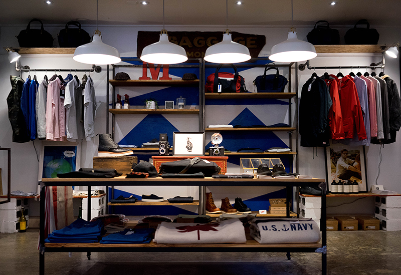
If you can learn how to design your store in a way that appeals to human psychology and influences the brain to make buying decisions, you’ll find it fairly easy to increase your sales. The question is, where do you begin?
4 Retail Store Design Hacks
The average company doesn’t put very much thought into a store’s design and layout. Sure, the big players like Walmart, Target, and Bed Bath & Beyond certainly do. But when it comes to the average fashion boutique or corner store, it’s usually not a huge focal point. For the most part, these stores prioritize practicality over shopper psychology.
If you want to increase sales, it’s time to flip the traditional approach on its head. Here are several retail store design hacks you can use to get customers to buy more product.
Make Aisles Wider
Paco Underhill wrote a book Why We Buy, which looks at some of the psychological components of purchase decisions (particularly as it deals with retail stores). One of the most interesting findings from his research was something he calls the “butt-brush effect.”
In the book, he explains how his research team reviewed tape from a store to study how shoppers navigate different displays during busy times. They paid especially close attention to a tie rack.
“Shoppers would approach it, stop and shop until they were bumped once or twice by people heading into or out of the store,” Underhill writes in the book. “After a few such jostles, most of the shoppers would move out of the way, abandoning their search for neckwear.”
In other words, even if people were slightly interested in the merchandise, the pressure of other shoppers caused them to be less interested.
While it’s not always possible, retail stores can alleviate this issue by making wider aisles and creating more walking room around key displays.
Establish the Right Ambiance
Ambiance is everything in a store. Here are some ideas:
- Avoid harsh, fluorescent lighting if possible. Instead, opt for a strategic lighting design that incorporates warm, layered lighting.
- Boutiques and smaller shops should try to create a warm and cozy ambiance. Something as simple as adding a seating area with an electric fireplace insert could totally change the look and feel of your store.
- Don’t forget about smell. Lighting seasonal candles can really put shoppers in the mood to buy.
Go Easy in the Decompression Zone
Every store has something Underhill calls a “decompression zone.” This is the place where shoppers adjust to the new environment and start to soak in the overall ambiance. It’s usually at the front of the store.
For best results, avoid placing major displays, sale items, or lots of signage in the decompression zone. Shoppers tend to miss a lot of this information. It’s better to keep this area clean and simple.
Be Smart With Signage
When it comes to retail signage, simple is better. Avoid cramming too many elements onto a single sign. Instead, establish a clear focal point and use varying colors and font sizes to emphasize specific information. However, it’s all relative. The placement of a sign dictates how it can be used.
“The more time the customer will be spending looking at the sign, the more information you can include,” Signs By Tomorrow explains. “For example, a sign near your cash register, where your customer will be waiting for a transaction to be processed, can provide details of a contest or return policy.”
If in-store signage is tripping you up, you can always partner with professional designers and copywriters to create a specific strategy.
Transform Your Store
Sometimes the smallest tweaks can make the biggest difference. Whether it’s spacing out inventory more to create visual breathing room, or installing new lighting to create a softer glow, tiny changes may lead to significant improvement. Give it a try and track the results!
Hits: 6692 | Leave a comment


